Who is SP RHODES?
We are a Wellington Florida based agency with a mission focuses on making high-quality equestrian products and services more accessible. We are dedicated to innovation, always seeking to turn the ordinary into extraordinary. Our goal is to build and create products that excel in both performance and design.
We don’t just talk, we “DO”.
We maintain one critical core value that is central:
We build solutions on a foundation of skill, well-established connections and emerging technology.
SP RHODES operates across three distinct, specialized divisions:
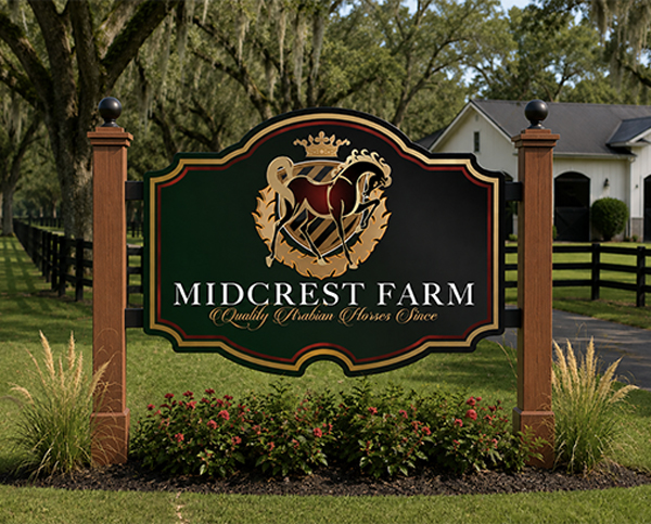
Professional creative services. We operate a full-service design studio, meticulously staffed with uniquely skilled creative professionals. Our team started in servicing equestrian sport but has expanded to support hundreds of corporate clients globally; both inside and outside equestrian sport. We work with everyone from animal health start-ups to pharmaceutical companies; real estate firms, horse shows and small farms.
Retail. Our website features over 500 different products that can be customized with your logo. We offer both OEM and ODM manufacturing services for individuals and companies looking to start a new brand or produce small run custom products for promotional distribution.
Consulting. The growth of our business is a testament to our strategic approach. Yes, our executive team are horse lovers; but we are business people first; we are disruptive strategists, MIT-educated technologists, software engineers and luxury retail superstars with over 30 years of experience. We work with some of the most prestigious horse shows and big business – connecting our clients, introducing income-generating ideas and producing a competitive advantage. When you work with SP RHODES, you share our resources. That alone is worth a conversation.

Elizabeth Rhodes

Victor S.
1. CREATE REVENUE STREAMS
Creating revenue streams means developing new ways for a business, venue, or event to generate income - such as merchandise programs, sponsorship packages, retail sales, licensing, custom products, and digital infrastructure - often producing enough additional revenue to more than cover the cost of working with our team.
Our references are best-in-class and we are happy to share our success stories.
2. BUILD BRAND PROGRAMS
We help build a consistent system that represents a venue's identity across everything the public sees, from apparel and merchandise to signage, sponsor displays, retail products, digital presence, and event presentation.
Instead of just making a logo or a product, this involves designing how a brand looks, feels, and functions in real situations, ensuring that every touchpoint - at horse shows, in stores, online, or with sponsors - works together to strengthen recognition, credibility, and revenue.
3. SPONSOR DELIVERABLES
Sponsor deliverables is the branding of items a sponsor is promised in return for their support, such as logos on signage, apparel, merchandise, jumps, digital media, and event materials. Managing sponsor deliverables means making sure everything is produced, placed, and presented correctly so the sponsor receives the visibility and value agreed to.
We can build a custom sponsor book with quality branded items that satisfy the sponsor and elevate exhibitor experiences.
4. SUPORT EXHIBITOR EXPERIENCES
Supporting exhibitor experience means improving how riders, owners, and clients interact with an event or brand by providing well-designed products, clear branding, organized systems, and high-quality merchandise that make participation more fulfilling, more professional, and more enjoyable.
")
OUR BRAND
SP RHODES is about quality lifestyle and systematic branding.
Our icon is a symbol of leadership and strategy. Much like the King in a chess game, your brand needs to be strategically positioned for success at all times.
We use this symbol to highlight the importance of a well-planned brand strategy. Whether through quality products or emerging technology, our goal is to enhance brands to achieve excellence.
When you see our icon, think, “Quality experience, invaluable relationships and certain growth.”
THE WORDMARK
The SP RHODES wordmark features an incomplete letter “O” that has been inspired by an ensō (“circular form”; a circle that is hand-drawn in one or two uninhibited brushstrokes) to express a moment when the mind is free to allow creativity.
It also represents the idea that great business success requires the ability to execute consistently and tirelessly; we capitalize on the momentum of success.
There will always be gaps in this continuum and it is our job to recognize where we can bridge these gaps through quality process and strategy.